Friday, March 14, 2014

Photographer Spotlight: Allan Teger

Today's photographer spotlight samples the work of Allen Teger.


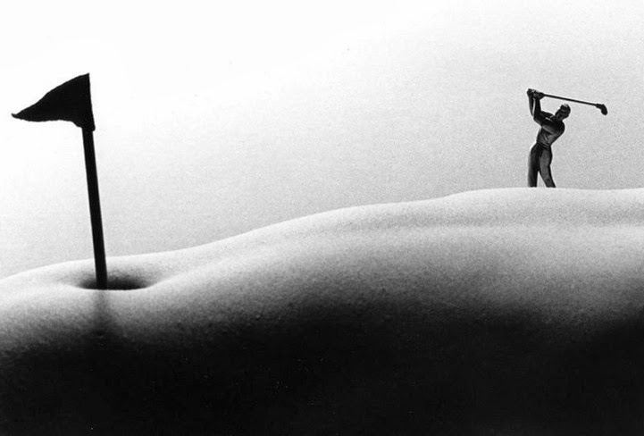
I recently borrowed a macro photography book from my instructor, Kate. While looking through the book, I stumbled upon this very interesting, creative macro image by Allen Teger (as seen above). 


This body of work, known as "Bodyscapes," has appeared in magazines, newspapers, and galleries all over the country. These images have also been featured on US television.


As you can see, Teger uses macro photography to abstract the nude human body and imply landscape.
He creates unique scenes with the help of mini figurines and tiny props.


While I don't have a desire to make these kinds of images, I do appreciate the artist's imagination and creativity. The concept is interesting, and it takes a playful spin on nude in photography.


You can find some of Teger's most popular "Bodyscape" images on his website:
And for even more images, check out the project gallery website:

Thursday, March 13, 2014

Photographer Spotlight: Andrew Whyte

Today, while researching topics for my own monograph, I stumbled across the work of Andrew Whyte.
 
                             "Curveball"                                             "In Plain Sight"                                          
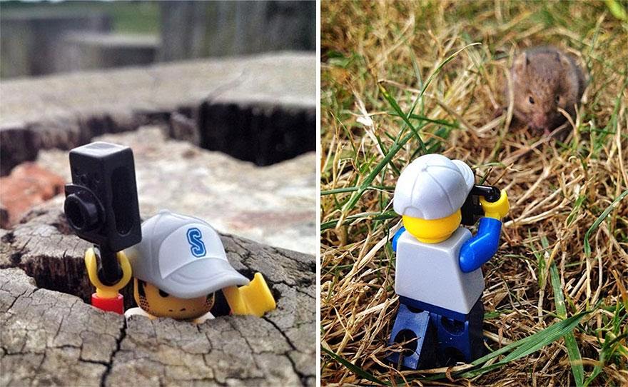
Whyte, who is most noted for his long exposure images, recently finished a 365-day project in which he traveled the world, photographing a tiny "Legographer."
This is the body of work that drew me in. 


 I find these images to be quite creative! Definitely simple, but ingeniously creative.
These narrative images are reminiscent of childhood. They're fun and highly imaginative.


To my surprise, these images were all captured with Whyte's iPhone.
Because his project required him to capture images of his Lego Minifigure every day for a year, he opted to use his phone out of convenience and time efficiency.


I first found out about this project when I stumbled upon this article:
You can check even out more images from Whyte's "Legographer" photo series at 

Wednesday, March 12, 2014

Article on Photo Exhibition Chosen for Publication

I was assigned to write a newspaper article pertaining to some aspect of campus life for my mass communications class a couple of weeks ago, and I chose to write a piece on the photo exhibition my photography class had the opportunity to put together. I just found out the article was selected for publication in the school newspaper!

Here's a link to the online article:
http://sccougarnews.com/2014/03/07/scc-photography-students-present-exhibition-at-local-gallery/

Tuesday, March 11, 2014

Render Reflection in Photoshop

For anyone interested in playing around with the reflection effect I used for the FX assignment, you can find the detailed tutorial, with step-by-step screenshots, at:

Here's my image again. I'm not totally happy with it, but I can say I'm definitely more comfortable with Photoshop because of the process I had to go through.


If I ever find the time, I think I might play around with it again at a later date. I think some of the settings need  a little tweaking to fit larger sized images than what was used in the tutorial. The ripples, for example, aren't as drastic in my image as they are in the sample image, even though I pushed the settings as far as I could in photoshop to try to counter the difference in image size .

Split-Toning Color Images

Split-toning is normally described as the process of taking a black and white image and adding different color tints to the highlights and shadows. Today, with manipulation software this can easily be done with both B&W images AND color images. This process can create some pretty cool, pretty wacky effects that emulate what can sometimes happen when processing and developing rolls of film.

For the recent FX assignment, I chose to explore the split-toning effect as instructed by one of our handouts.
The process is really rather simple, and it doesn't take long to achieve the intended effect. 

I played around with two different images of mine, and these are my results:
Original Image
Split-Toning in Photoshop                                                        Split-Toning In Lightroom
Original Image
Split-Toning In Photoshop                  Subtle Split-Toning in Photoshop                Split-Toning in Lightroom
Personally, I'm not a fan of the green hue that tends to come across in most images. However, I imagine it works better with some images than it does with others.
For the sake of comparison, I worked with the same image in both Photoshop and Lightroom because you can achieve a split-tone effect with both programs. I think I actually like the split-tone effects that were produced through Lightroom more so than the ones produced in Photoshop.
What do you think?

Monday, March 10, 2014

Photographer Spotlight: Sarolta Bán

Today, I wanted to share with you the work of Sarolta Bán.


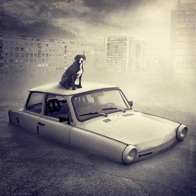
Bán is a self-taught Hungarian photographer whose work specializes in digital manipulation.


There's something about her images that I find mysterious and strangely compelling. 
They are fantasy-driven narratives that have very dreamlike qualities to them. 


Bán often uses animals in her images. 
Most recently, she completed a project with the purpose to help rescued animals find homes.
This project is how I found out about her work. (Ellen DeGeneres shared it on her Facebook and Blog.)


I love the concept! Such a great cause!

To read a brief article on the project, check out:
View more of Sarolta Bán's work on her website:


Sunday, March 9, 2014

Photographer Spotlight: Mike Moats

Today's photographer spotlight highlights the work of Mike Moats.


Moats is an American professional macro photographer. 
His work is featured in various magazines, newsletters, and websites. 
His first monograph, Tiny Landscape, was released in  2008.
Moats has given macro/close-up photo workshops in a number of cities all over the country.


I've always had a love for nature and wildlife photography. I thoroughly enjoy shooting nature subjects, especially with a macro lens. That being said, I actually kind of liked that Moats's work extends to subjects beyond nature. While, yes, a large portion of his work is nature-based, he also has quite a bit of work that focuses on what I would consider to be ordinary objects.


Moats also does macro work that abstracts ordinary objects in a way that you don't always immediately recognize what the object is that he is photographing. These images seem to focus on texture and pattern.


 All of these images are interesting to look at!
I'm fascinated by the amount of detail that can be revealed through macro photography.


You can check out more of Mike Moat's macro work on his website:

Thursday, March 6, 2014

ARTBOOK: Monograph Examples

I finally found a little bit of time to sit down and try to research for my book. I came across this site full of artist monographs. While it doesn't necessarily let you access the actual books, it does give a little summary of the work and I think it at least helps to get an idea of what these artists are doing in the world.
Trying to find inspiration and get the juices flowing.
As of now, I'm not totally content with what I've picked for my book.

Here's the link to the monograph catalog:
http://www.artbook.com/catalog--photography--monographs.html

Saturday, March 1, 2014

Photographer Spotlight: Manuel Cafini

Today, I wanted to take a second to share this image by Manuel Cafini.

Particularly, this image is a good example of macro photography that utilizes the illusion of motion, either through a long exposure or photoshop (I cannot tell in this case). 
Cafini is an Italian photographer who, for the most part, considered himself to be a studio photographer. He spends a lot of time photographing people, specifically dancers and the human body in motion. 
This snail image makes me think about playing with motion in my own close-up images, especially the ones involving animals and nature. The tilted angle also gives something to think about as it offers the image some interesting tension and gives the image some artistic flair.

You can check out the rest of Manuel Cafini's portfolio on his website:
http://www.manuelcafini.it/