Friday, May 16, 2014

William Stafford - Ask Me

Ask Me by William Stafford


Some time when the river is ice ask me
mistakes I have made. Ask me whether
what I have done is my life. Others
have come in their slow way into 
my thought, and some have tried to help 
or to hurt: ask me what difference
their strongest love or hate has made.

I will listen to what you say.
You and I can turn and look
at the silent river and wait. We know
the current is there, hidden; and there
are comings and goings from miles away
that hold the stillness exactly before us.
What the river says, that is what I say.

Wednesday, May 14, 2014

Illustration Friday for This Semester

For my illustration class, we were supposed to choose 5 words to illustrate from the website: www.illustrationfriday.com. Then we were supposed to post them someplace online.
Here are my illustrations! Of course, I could have done better, but I ended up having to do all but the space one in one night...

03-21 - "Red"


02-21 - "Space"


02-14 - "Twisted"


02-07 - "Prehistoric"


01-31 - "Exotic"


Saturday, May 10, 2014

Photographer Spotlight: Tim Flach

I've had this one bookmarked for a while now. Check it out ...


It's the work of Tim Flach.

Flach is a British photographer who has been capturing images of exotic animals for the last two decades.


He is most well-known for his highly conceptual images.


With his animal portraits, Flach uses techniques similar to human portraiture that capture a variety of of gestures and expressions which seem to echo our own movements and emotions.


He is even an author of four photography driven books: Evolution, Equus, Dogs Gods, and More Than Human.


I think Flach's images are stunning! Light, form, and composition are consistently beautiful.


To see more work by Tim Flach, check out his website:
And here is how I found out about Flach. The New York Times posted an article featuring his work:

Thursday, May 8, 2014

Artist Spotlight: Phillip K. Smith III

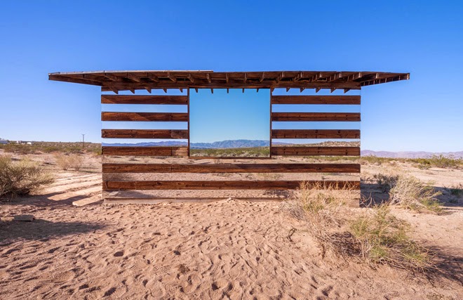
I just came across this piece by American installation artist, Phillip K. Smith III, and wanted to share.
The piece, located in Joshua Tree, California, is titled "Lucid Stead."


Smith uses mirrors to give an illusion of transparency.
I think it's really cool he was able to use something as simplistic as mirrors to make it look like we are looking straight through the slats of the building.

By day...


And by night...


To learn more and to see more images, check out this article about Phillip K Smith III:
http://www.urdesign.it/index.php/2013/11/25/lucid-stead-light-installation-by-artist-phillip-k-smith-iii-in-joshua-tree-california/

Wednesday, April 30, 2014

Photographer Spotlight: Zahir Batin

Even though I'm no longer focusing on macro for my book this semester, I just stumbled across the work of Zahir Batin and wanted to share.


As you can see, Batin uses small toys and action figures (primarily Star Wars figures) to portray miniature, but realistic scenes. I find his work to be very creative -- fun and playful too! Some images are more dramatic than others, but they are all clearly narratives.


I first found out about Zahir Batin's work in the following article:
His work was also featured in an article on the Internet magazine, Bored Panda:
And finally, here you can check out a large collection of Batin's work which includes macro photography with insects, small animals, and action figures in addition to Star Wars:

Friday, April 25, 2014

"From the River's Edge" by Erin Petty

After a very stressful couple of days, my advanced digital photography semester project is finally finished and uploaded for your viewing pleasure! Check it out!

Monday, April 7, 2014

Musical Artist: Albert Hammond - Down by the River (1975)

I was doing a little research for my book, and I came across this catchy little folk song from the 70's.
I think it has an important message we all should hear about our impact on nature.


Here are the lyrics (so you can sing along, of course):

City life was gettin' us down
So we spent the weekend out of town
Pitched the tent on the patch of ground
Down by the river

Lit a fire and drank some wine
You put your jeans on the top of mine
Said, come in the water's fine
Down by the river

Down by the river
Down by the river
Said, come in the water's fine
Down by the river

Didn't feel too good all night
So we took a walk in the morning light
Came across the strangest sight
Down by the river

Silver fish lay on its side
It was washed up by the early tide
I wonder how it died
Down by the river

Down by the river
Down by the river
Silver fish lay on its side
Down by the river

Doctor put us both to bed
He dosed us up and he shook his head
Only foolish people go, he said
Down by the river

Why do willows weep, said he
Because they're dying gradually
From the waste, from the factories
Down by the river

Down by the river
Down by the river
Why do willows weep, said he
Down by the river

In time, the river banks will die
The reeds will wilt and the ducks won't fly
There'll be a tear in the otter's eye
Down by the river

The banks will soon be black and dead
And where the otter raised his head
Will be a clean white stone instead
Down by the river

Down by the river
Down by the river
Will be a clean white stone instead
Down by the river

Friday, March 14, 2014

Photographer Spotlight: Allan Teger

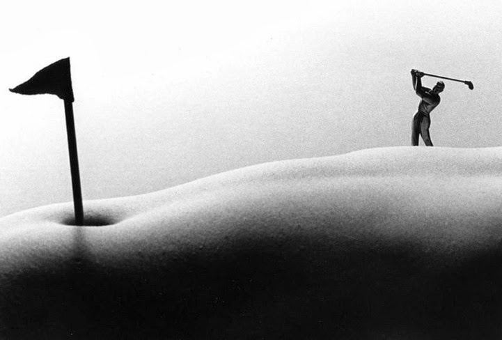
Today's photographer spotlight samples the work of Allen Teger.


I recently borrowed a macro photography book from my instructor, Kate. While looking through the book, I stumbled upon this very interesting, creative macro image by Allen Teger (as seen above). 


This body of work, known as "Bodyscapes," has appeared in magazines, newspapers, and galleries all over the country. These images have also been featured on US television.


As you can see, Teger uses macro photography to abstract the nude human body and imply landscape.
He creates unique scenes with the help of mini figurines and tiny props.


While I don't have a desire to make these kinds of images, I do appreciate the artist's imagination and creativity. The concept is interesting, and it takes a playful spin on nude in photography.


You can find some of Teger's most popular "Bodyscape" images on his website:
And for even more images, check out the project gallery website:

Thursday, March 13, 2014

Photographer Spotlight: Andrew Whyte

Today, while researching topics for my own monograph, I stumbled across the work of Andrew Whyte.
 
                             "Curveball"                                             "In Plain Sight"                                          
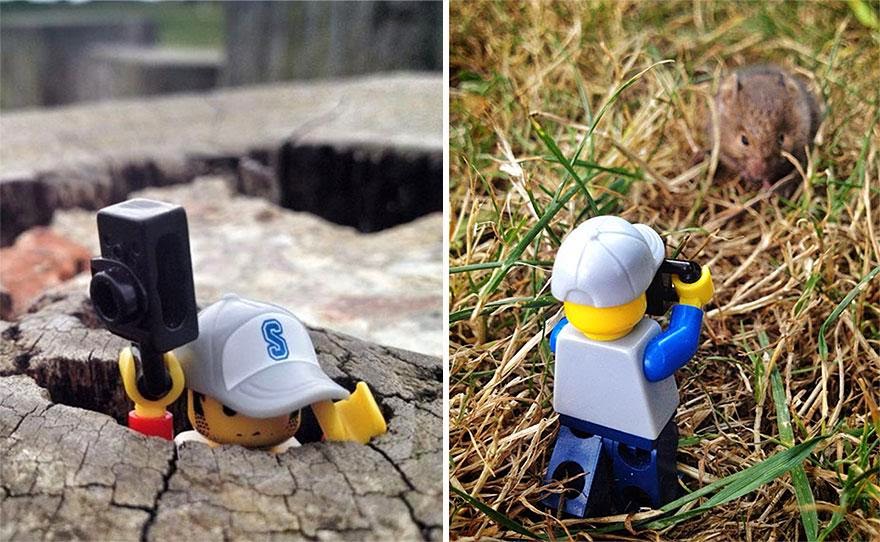
Whyte, who is most noted for his long exposure images, recently finished a 365-day project in which he traveled the world, photographing a tiny "Legographer."
This is the body of work that drew me in. 


 I find these images to be quite creative! Definitely simple, but ingeniously creative.
These narrative images are reminiscent of childhood. They're fun and highly imaginative.


To my surprise, these images were all captured with Whyte's iPhone.
Because his project required him to capture images of his Lego Minifigure every day for a year, he opted to use his phone out of convenience and time efficiency.


I first found out about this project when I stumbled upon this article:
You can check even out more images from Whyte's "Legographer" photo series at 

Wednesday, March 12, 2014

Article on Photo Exhibition Chosen for Publication

I was assigned to write a newspaper article pertaining to some aspect of campus life for my mass communications class a couple of weeks ago, and I chose to write a piece on the photo exhibition my photography class had the opportunity to put together. I just found out the article was selected for publication in the school newspaper!

Here's a link to the online article:
http://sccougarnews.com/2014/03/07/scc-photography-students-present-exhibition-at-local-gallery/

Tuesday, March 11, 2014

Render Reflection in Photoshop

For anyone interested in playing around with the reflection effect I used for the FX assignment, you can find the detailed tutorial, with step-by-step screenshots, at:

Here's my image again. I'm not totally happy with it, but I can say I'm definitely more comfortable with Photoshop because of the process I had to go through.


If I ever find the time, I think I might play around with it again at a later date. I think some of the settings need  a little tweaking to fit larger sized images than what was used in the tutorial. The ripples, for example, aren't as drastic in my image as they are in the sample image, even though I pushed the settings as far as I could in photoshop to try to counter the difference in image size .

Split-Toning Color Images

Split-toning is normally described as the process of taking a black and white image and adding different color tints to the highlights and shadows. Today, with manipulation software this can easily be done with both B&W images AND color images. This process can create some pretty cool, pretty wacky effects that emulate what can sometimes happen when processing and developing rolls of film.

For the recent FX assignment, I chose to explore the split-toning effect as instructed by one of our handouts.
The process is really rather simple, and it doesn't take long to achieve the intended effect. 

I played around with two different images of mine, and these are my results:
Original Image
Split-Toning in Photoshop                                                        Split-Toning In Lightroom
Original Image
Split-Toning In Photoshop                  Subtle Split-Toning in Photoshop                Split-Toning in Lightroom
Personally, I'm not a fan of the green hue that tends to come across in most images. However, I imagine it works better with some images than it does with others.
For the sake of comparison, I worked with the same image in both Photoshop and Lightroom because you can achieve a split-tone effect with both programs. I think I actually like the split-tone effects that were produced through Lightroom more so than the ones produced in Photoshop.
What do you think?